
Inside My VIP Workflow: How To Make Books Look Better
And It's Stupid Easy.

Sometimes “good” just isn’t enough. And sometimes… it’s not even good. Let me explain.
I see this all the time on Substack—many people are making this mistake. The book graphics. Yes. A lot of them look…too “normal.” They don’t stand out. Some of them look rushed, like they were thrown together in five minutes. This makes you look the same as everyone else. And if you look like that, buyers will skip right over your book.
Here is what most people miss: you’re competing with millions of other authors whose covers don’t just exist…they stand out without trying.
And whether we like it or not…people judge a book by its cover. They will not pause to analyze it. People are busy. They scroll and decide in SECONDS what they want. If it feels like everything else, they’re gone.
So here is how you can make your books stand out! And the best part? It’s completely FREE.
The Reveal: Google Pomelli And What It Is

There is a massive advantage to “captured” imagery over “generated” imagery. This is what most people get wrong about Google Pomelli. It is NOT a graphic generator. It doesn’t build an image from nothing. It takes your flat book cover and applies the physics of a professional photoshoot. It adds realistic lighting and depth. It makes a digital file into a high-end visual.
The Non-Workflow: Simple to a Fault
Minimalism beats complexity every time. My “process” is now so simple it’s almost embarrassing. I upload the book cover. That’s it.
There is no pre-processing or “improving” the image first. No tweaking. I simply take the book cover art and upload it to Google Pomelli. Done.
Most of the time, you don’t have to touch anything. Every now and then, you might tweak something slightly—but it’s rare. Usually, it gives you multiple options to work with anyway. So if one feels off, you just skip it and move on.
Visual Evidence Gallery
This is how you move from a flat file to a scroll-stopping asset:
I’ll use one of our VIP’s book as an example.
Here is the original:

Now let’s plug it into Pomelli.
Ta Daaa!!!! Now that looks professional!


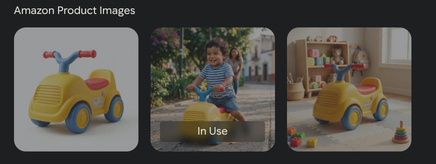
You can even have Pomelli do Amazon product images!!
Marketing is about pattern interrupts. Our brains are efficient filters. We are biologically programmed to ignore templates and ads.
This works because it doesn’t look “designed.” When people scroll through a feed of “made” graphics, they pause for things that feel real, even if they don’t know why. By removing the “designed” look, you remove the cue that tells a reader to keep scrolling.
The VIP Author Approach
Authors don’t have time to waste. When I work with VIPs, I try to move fast so they don’t have to. We do this to remove the guess work for them.
No overthinking it anymore. Just upload and move on. It’s a fantastic tool.
The Simplicity Reinforcement (What You Don’t Need)
Most creators fall into a complexity trap. They think more work equals more reward. It doesn’t.
Think: I need better design skills, more tools, and more time.
Reality: You need to stop interfering with the process.
It’s not a process… it’s just simpler than people think.
Inefficiency has a cost. Every hour you spend tweaking a template is an hour you aren’t writing.
You can keep doing it the hard way—tweaking layouts and fighting for scraps of engagement. Or, you can let something else do the heavy lifting.
Start sharing imagery that actually makes people stop.
Join The VIP Authors!


Thanks for sharing this!!
Isn't this the same as what Bookbrush and Canva offer? Good to know there's a free option as well.